SpiderRock Gateway has released a new visualization tool designed to assist users in researching relative option values (click here to read the press release). The Chart Tool combines SpiderRock’s ten years of US stock, index, ETF, and ADR data with its proprietary volatility surface analytics to provide a robust and user-friendly interface for charting historical and implied volatility trends.
The hallmark of the Chart Tool is to assist users in visually displaying historical options data and analytics for individual or multiple symbols in a synchronized format where relative comparisons and time-series alignment are simplified. Users can visualize a multitude of series, including up to 10 years of implied and realized volatilities, skew, high/low, open/close prices, trade volume, and earnings dates. The researcher can also analyze and exhibit price and volume historical data with earning’s date overlays.
Additional features allow users to analyze stock option pairs, ratios, and spreads by creating charts for common option combinations. This empowers users to find the data needed on-demand, eliminating the excess time and effort to sift through large datasets. Once a researcher completes an analysis, he or she can save, download, and share models easily with others. The tool also gives users the capability to create custom datasets and view the charts in a tabular format to perform further analysis.
Common Use Case
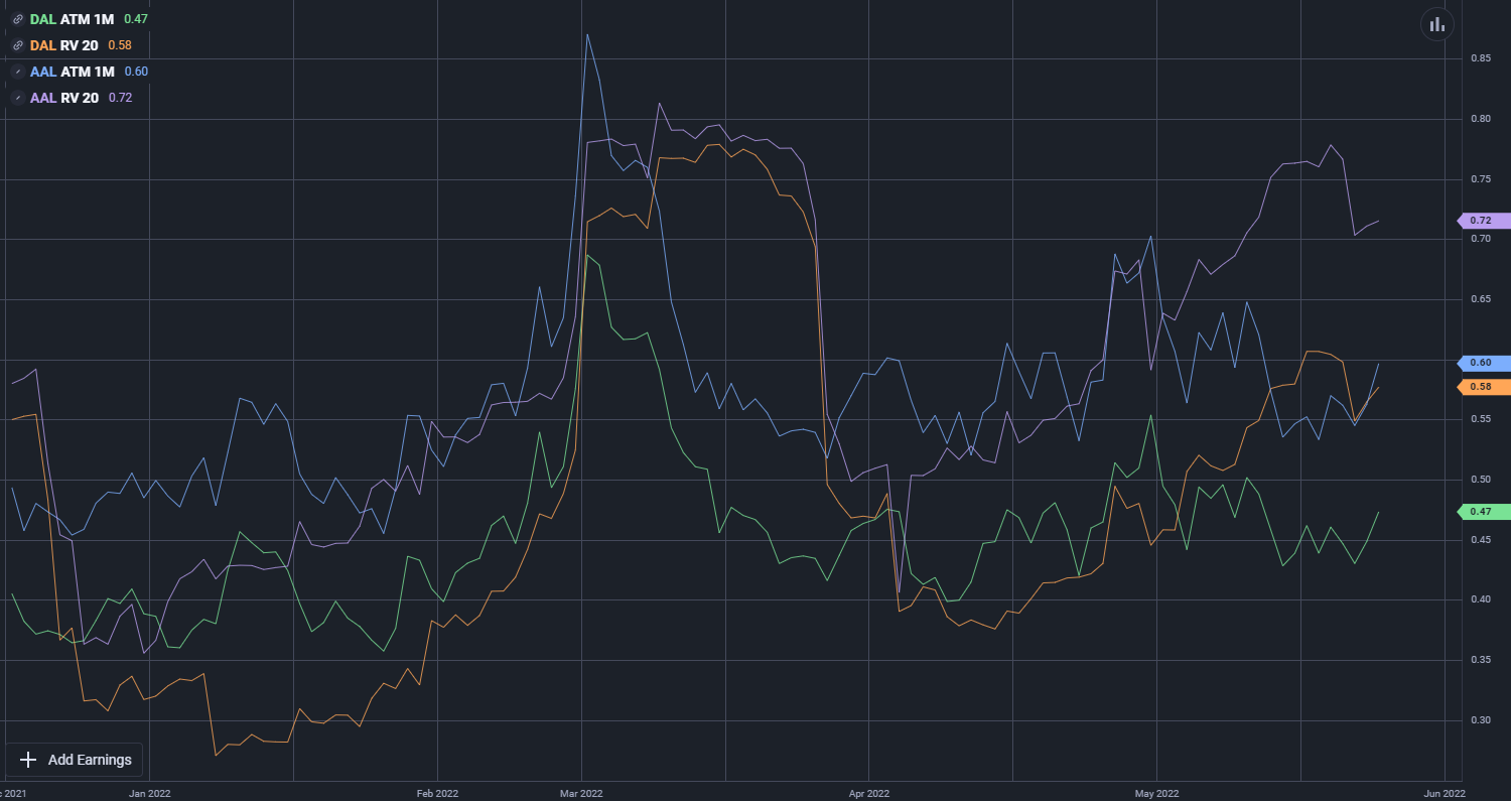
One use case for the Chart Tool that features the capabilities, data, and analytics available to users is a volatility and ratio analysis performed by plotting implied and historical volatility. By doing this, users can evaluate an option for an underlying stock compared to its historical value. In the example below, the researcher is looking at the plots of American Airlines (AAL) and Delta Airlines (DAL). For these two stocks, the chart tool will present both the 1-month at-the-money implied volatility and 1-month historical volatility.

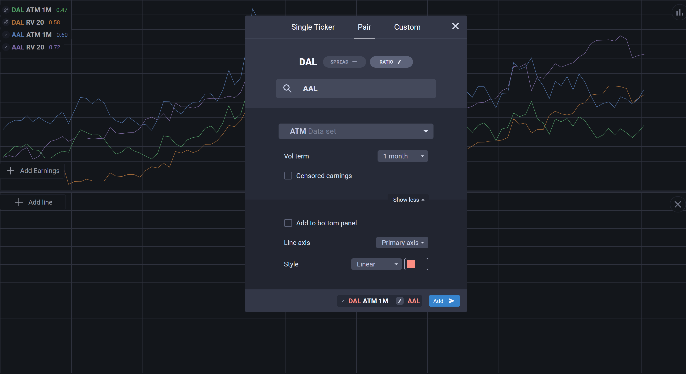
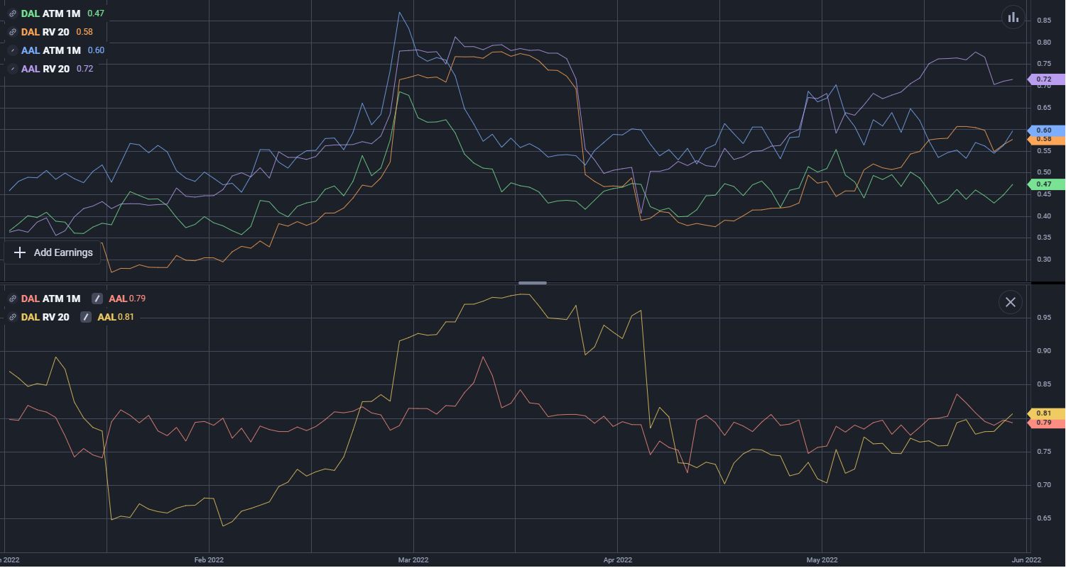
Users can see the difference between the implied and historical volatility for an underlying stock up to the most recent close. This allows users to monitor and track the volatility of different stocks from day-to-day by simply saving views and checking the tool each day as the database updates. Another use case is the ability to do ratios between two sets of data. For this example, we will ratio DAL’s volatility over AAL’s volatility. The chart tool will be able to display both the implied and the historical volatility, allowing users to research the relative value of option pairs. To create a ratio, the user will go to the Add Line option and navigate to the Pair tab. After selecting spread or ratio, the user will be able to compare their linked ticker with any other available and choose what data series to display.

These settings then linearly display the ratio between the stocks’ volatility over time. These ratios have many uses for the different options.

