The options markets and implied volatility can be rich sources of insight into market signals. Comparing historical data with current market signals can provide additional insights to help traders and investors understand market expectations as earnings events approach for stocks (see recent surprises by stocks like GS, NFLX, and FB).
Fixed Term Implied Volatility
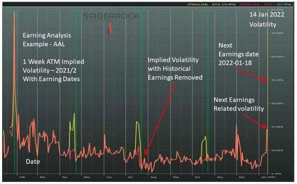
Fixed-term implied volatilities are a representation of the equity options market’s view of the expected movement of a given stock within a given forward time frame (1 week, 1 month, 3 months, etc.). A stock’s at-the-money historical implied volatilities can be divided into two components. For equity options with regular earnings announcements, a volatility component due to forecasted future earnings announcement moves can be separated from a baseline volatility (with implied earnings effects censored). This approach removes the earnings volatility component from the original implied volatility curves. This use of this censored data improves modeling of relative volatility between stocks and also supports estimates of implied earnings moves as a stock with earnings approaches the event. The chart below isolates the event volatility of AAL (American Airlines) over time and shows how the ATM volatility ramps as events are approached.

This censored volatility when compared to the market uncensored volatility provides an estimate of how large a move a stock may undergo when the event is announced. However, it does not provide any directional information about the move. To look for insights on direction of a potential move, we can look at the skew of the volatility curve.
Volatility Skew Surfaces
The volatility surface skew is impacted by the supply and demand forces at play for a given option. When demand for puts or calls is relatively higher it tends to skew the volatility surface curve in the direction of the demand.
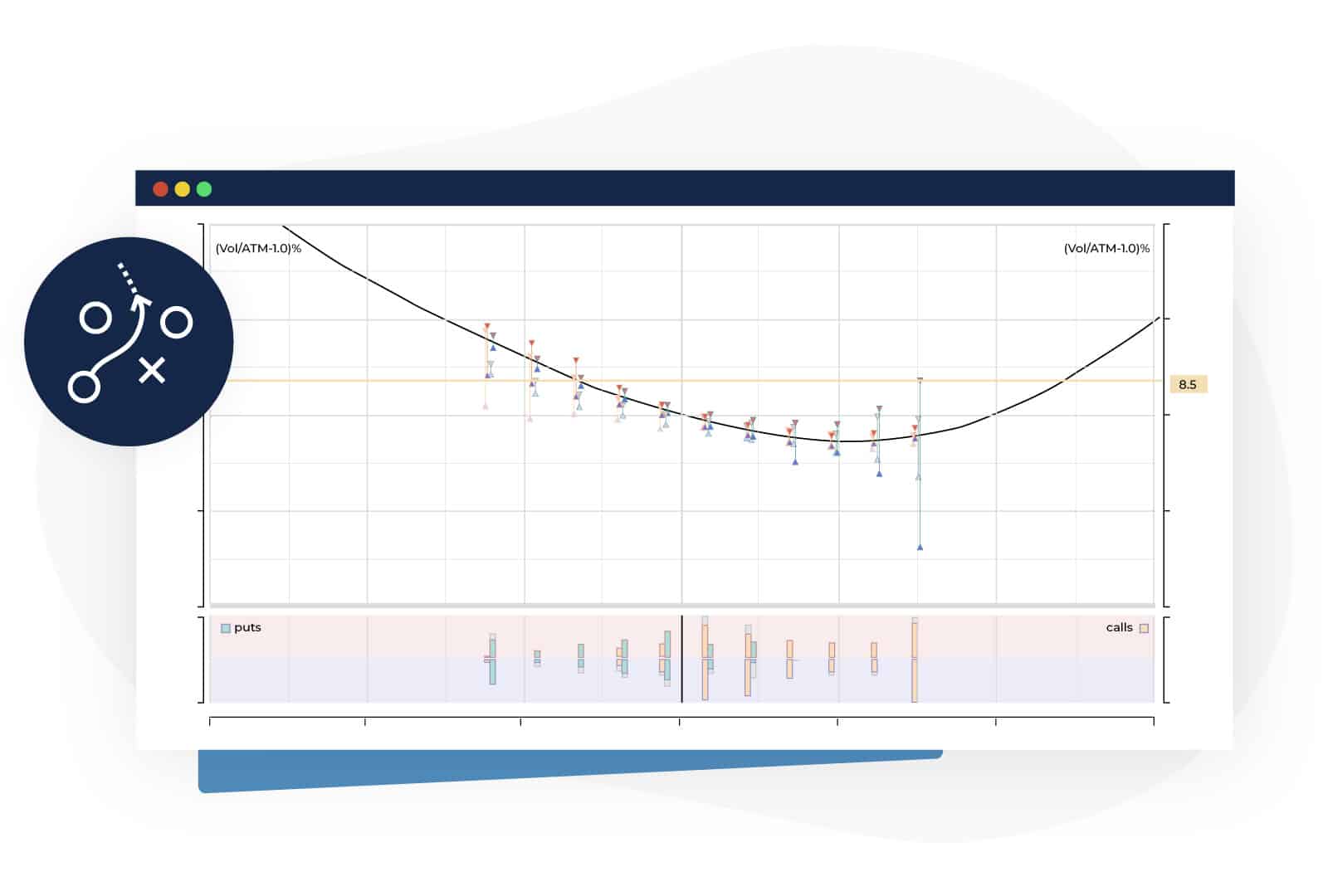
Historical skew slopes will differ from option to option, but an option’s volatility generally falls into a pattern where the demand for downside protection tends to drive the premium higher for puts than for calls. To illustrate this, the chart below shows a typical skew curve for SPX options. Out of the money put volatilities are to the left and out of the money call volatilities are to the right.

Tracking historical skew and looking for shifts in the shape or slope of the curve ATM as a stock approaches a defined event date can provide some directional insights. Further, as market flows have become more driven by retail investors who often take simple naked call or put positions, this skew signal may become more pronounced.
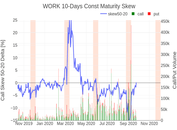
The following chart for Slack (ticker: WORK prior to its acquisition by Salesforce) illustrates the use of skew slope to provide insights ahead earnings. The chart tracks the demand for calls; you can observe that OTM call options became very cheap and correspondingly OTM puts very expensive for the March 2020 earnings as investors were looking for protection against declines, but the inverse was true in June and September when investors took a bullish stance on the stock and the demand for OTM calls increased.

